Monerti (The landlord App)
Product Design
Bahraini landlords were managing properties through WhatsApp and Excel. We built the tool they didn't know they needed.
Project type: Zero to one product design, from blank canvas to live app
Role: Lead UX/UI Designer at LevelZ Technologies. Responsible for the full product experience across all four surfaces: Monerti (Landlord app), Monerti home (tenant & homeowner app), Landlord & broker portal, and product website. Visual design, illustration, UX writing, and design system ownership all sat with me.
Industry: Proptech & fintech
Monerti is a Bahraini proptech platform connecting landlords, brokers, and tenants through a shared marketplace, property management tools, and an embedded financial layer covering upfront rent financing and online payments. I designed the full product family across four surfaces. This case study covers the landlord app
Property management in Bahrain runs on WhatsApp
Rent payments collected in cash or through BenefitPay, maintenance requests sent over voice notes. For landlords managing two, three, or five properties, every tenant communication lived in a separate chat with no way to track anything.
The problem isn't that this system fails immediately. WhatsApp works well enough to get by. But "well enough" hides costs: no payment records, no audit trail, no way to spot a late payment without scrolling back through messages. At small scale, landlords absorb that friction personally. As number of properties grows, the system breaks.
The Bahraini landlord in this space isn't technophobic. They use smartphones, they bank online. But no product had ever been built for their specific context, so they defaulted to the tools they already had.
Regional research confirmed the gap. In the UAE, Keyper had built a solid product around rent now pay monthly, solving the cheque based payment problem specific to Dubai's rental market and providing property management. In Saudi Arabia, Rize was doing the same. Both products were well designed and growing. Locally, Bahrain had one real estate product: Bahrain Finder, a listings marketplace. Once a property was rented, its job was done. Everything after, payments, maintenance, communication, renewals, fell back to WhatsApp.
The gap wasn't a lack of awareness. It was a lack of infrastructure. No one had built the layer that sits between "property listed" and "lease ended."
That was the problem Monerti was designed to solve.
Competitive Landscape
To understand the gap, we looked at what existed — locally, regionally, and in more mature proptech markets.
Bahrain Finder
Is the only property product built for the Bahraini market. It's a listings marketplace. It connects landlords to prospective tenants and stops there. Once a lease is signed, the platform has no further role. Payments, maintenance, communication, renewals all of it falls back to WhatsApp and phone calls.
Keyper (UAE)
is the closest regional product to what Monerti set out to build. It combines property management with a rent-now-pay-monthly model that lets tenants split annual rent into monthly instalments while landlords receive the full amount upfront. It's well-designed and growing. But it was built specifically around Dubai's rental market, where annual cheque-based payments are the norm. That financing structure doesn't map to Bahrain. Keyper has no presence here and no plans to expand into this market.
Rize (Saudi Arabia)
solves the same financing problem in the Saudi context, with over 200,000 tenants on the platform. Like Keyper, it's a payment splitting product first. Day-to-day property management — tracking maintenance, centralising communication, managing lease documents — is outside its scope. It operates exclusively in Saudi Arabia.
None of these products serve Bahraini landlords. Not because the market is too small to notice, but because each product was built to solve a specific problem in a specific market. Bahrain had no equivalent. The individual landlord managing two to five properties was left with a listings platform that stopped at signing, and a WhatsApp thread for everything else.
The gap Monerti was built to fill
Challange 1
One app, two completely different users
The original assumption was straightforward: landlords and tenants share the same platform, so building one app made sense. It reduced development complexity and kept the product simple to maintain.
It didn't work.
In beta release, users were confused. The flow for a landlord, listing a property, reviewing a tenant, approving a maintenance request, lived alongside the flows for a tenant, searching listings, submitting documents, raising a request. Both user types landed in the same space even with clear signal flow belongs to them.
The confusion wasn't a navigation problem. It was a mental model problem. A landlord and a tenant have fundamentally different relationships with a property. Putting them in the same app assumed they had enough in common to share a starting point. They didn't.
The decision: Split the product into two separate apps, one for landlords and one for tenants, each with its own entry point, its own information architecture, and its own tone. plus it gave more room to develop more features for each persona, without worrying about complexity.
Challange 2
KYC was killing conversions before users had a reason to care
Every user on Monerti needed to go through identity verification before they could do anything. That made sense from a compliance and trust perspective. The problem was placement.
KYC sat at the beginning of any action flow. Eight screens minimum. Document uploads, identity checks, waiting periods. A landlord who arrived wanting to list a property or request upfront rent financing hit a wall before they'd seen a single feature. Many didn't make it through.
The assumption behind KYC first was reasonable: verify first, then let users use the features. But it ignored a basic behavioural reality. Users don't complete long processes for abstract future benefits. They complete them when they have something specific at stake.
The decision: Move KYC to the end of the process, triggered only when a user is about to submit a listing or request a service. By that point they've already invested time in the product, they've seen what it offers, and they have a concrete reason to complete verification.
The result: Listing activity and service requests increased by from 1 per week to over 10 per week
Challange 3
Landlords were missing the things that mattered
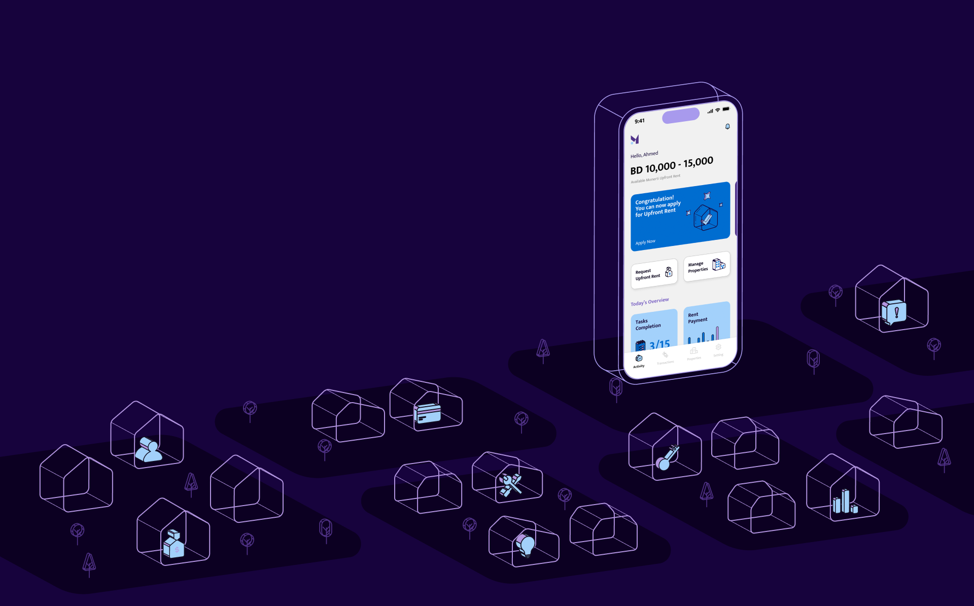
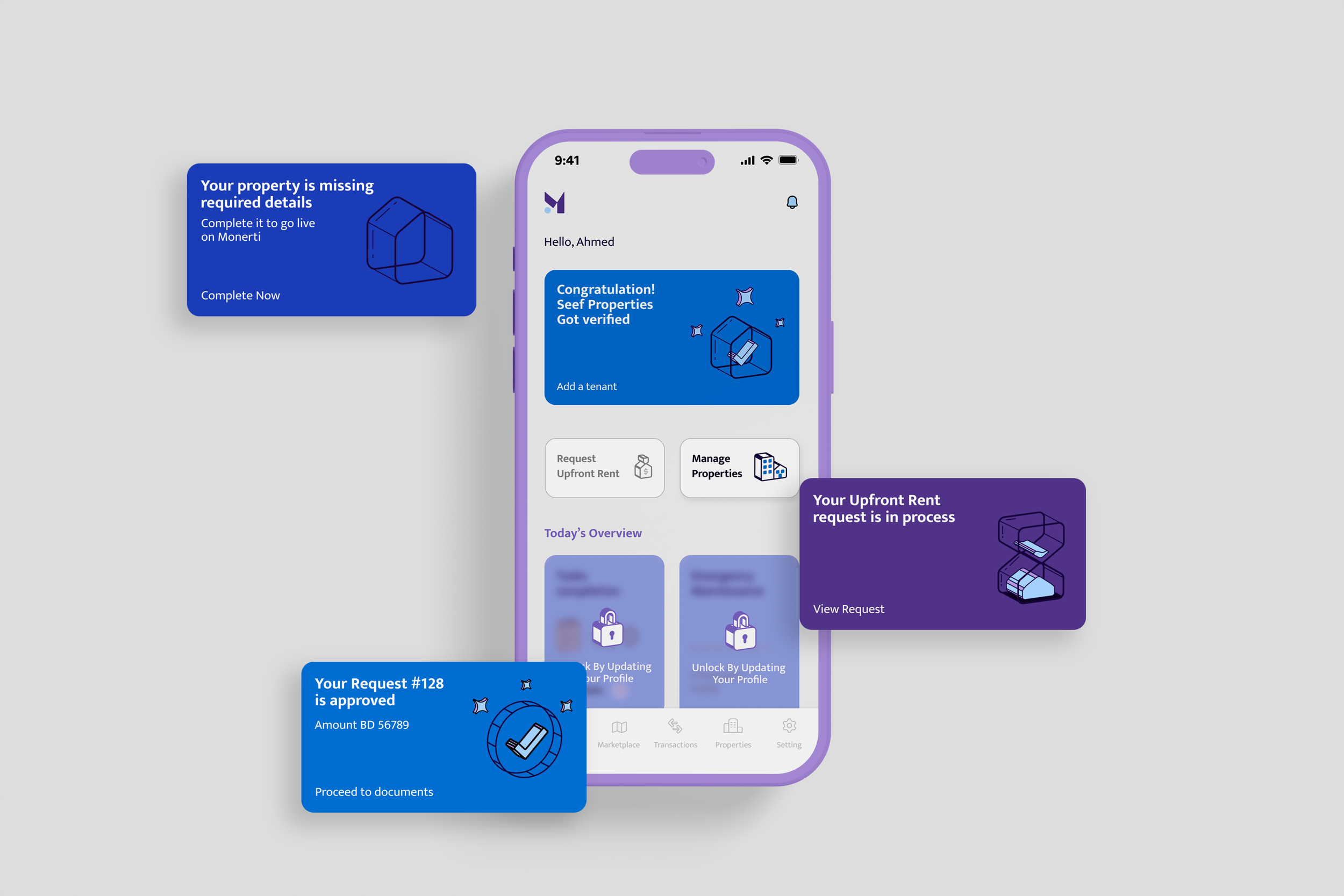
The original homepage was intentionally clean. A fixed banner at the top would show the next action, an important notification, or a service explanation if nothing was pending. The rest of the screen was minimal.
Post-launch feedback made it clear this wasn't working. Landlords were missing notifications. Not because the notifications weren't there, but because a single fixed banner at the top of a clean screen didn't carry enough visual weight to feel urgent. Users were scrolling past it or not registering it at all.
The decision: Redesign the homepage to surface information in sections rather than a single banner. Notifications now appear only when there is a genuine action required or something important to see, giving them more weight when they do appear. Supporting content is organised into sections that explain services in context rather than filling space when nothing is pending.
Challange 4
The verification process was creating a customer service dependency
When a landlord wanted to request upfront rent financing or property management services, the flow required them to go through the same full property listing process — entering all property details, verifying the property, then adding tenant information, then a separate verification stage for the tenant. Each step involved a handoff that sometimes pulled in the customer service team to move things forward.
The process was too long and too dependent on manual intervention. It was generating friction for users and operational load for the team.
The decision: Reduce the flow to the minimum information actually required for each service. A single verification stage replaced the multi-step process. Redundant information entry was removed. The customer service team's involvement dropped significantly because users could complete the process without getting stuck.
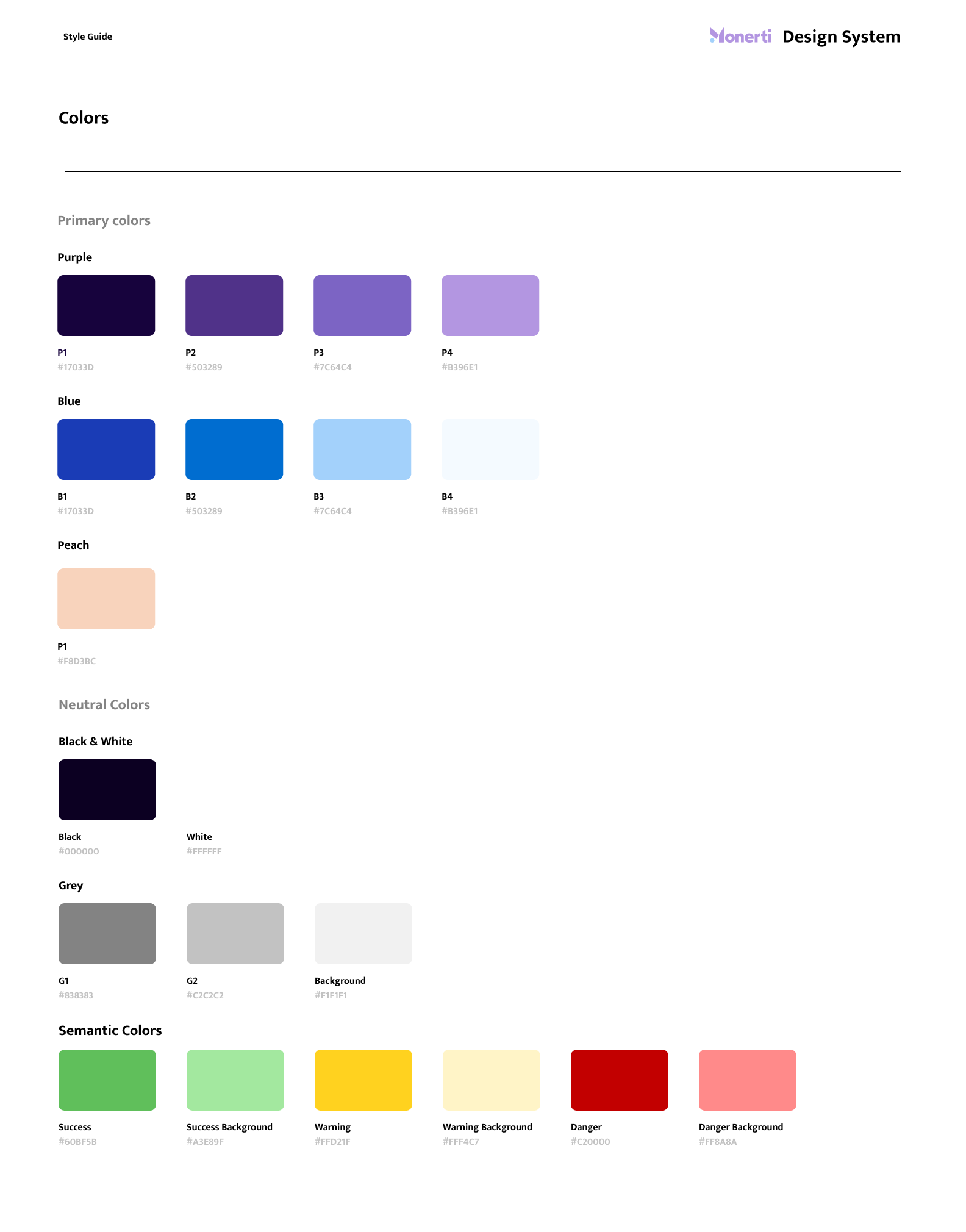
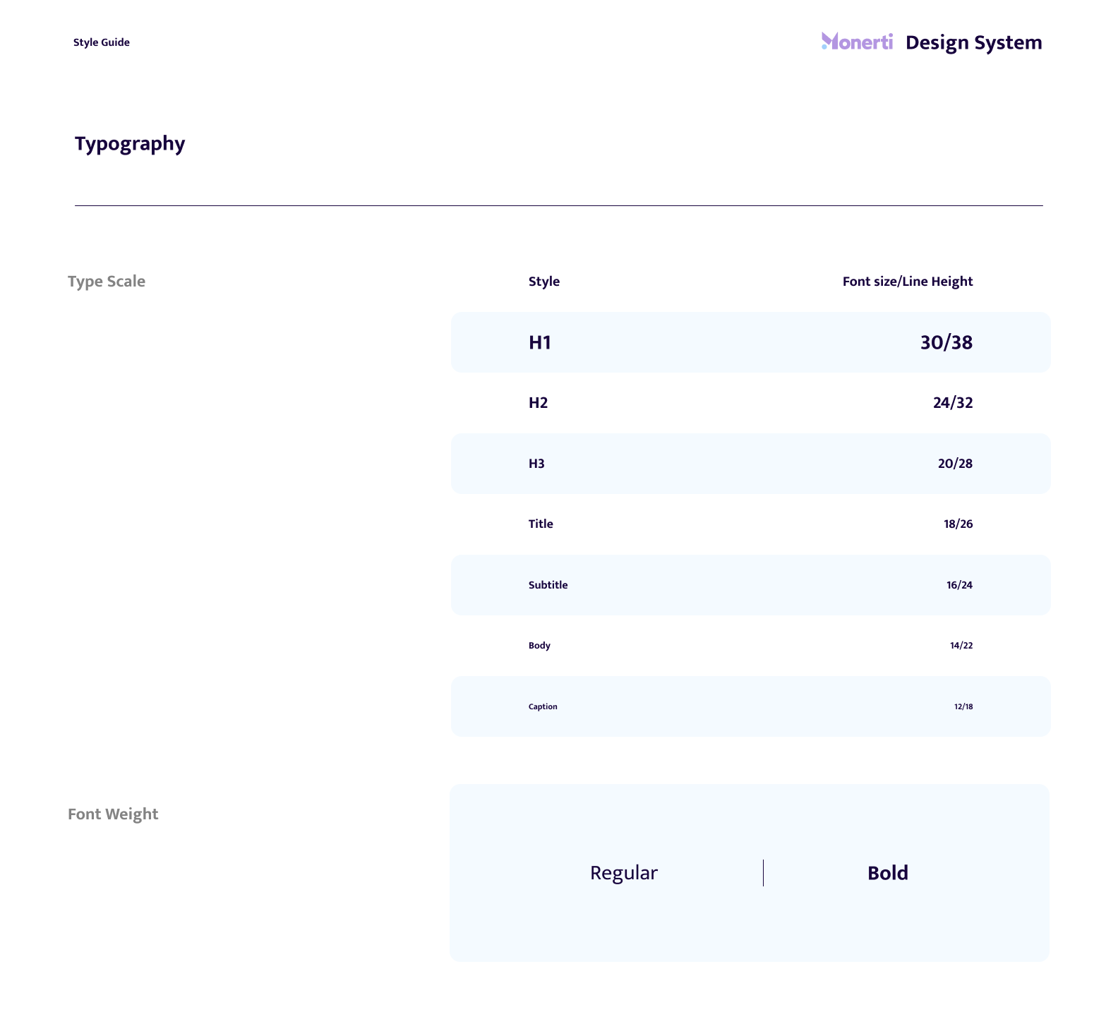
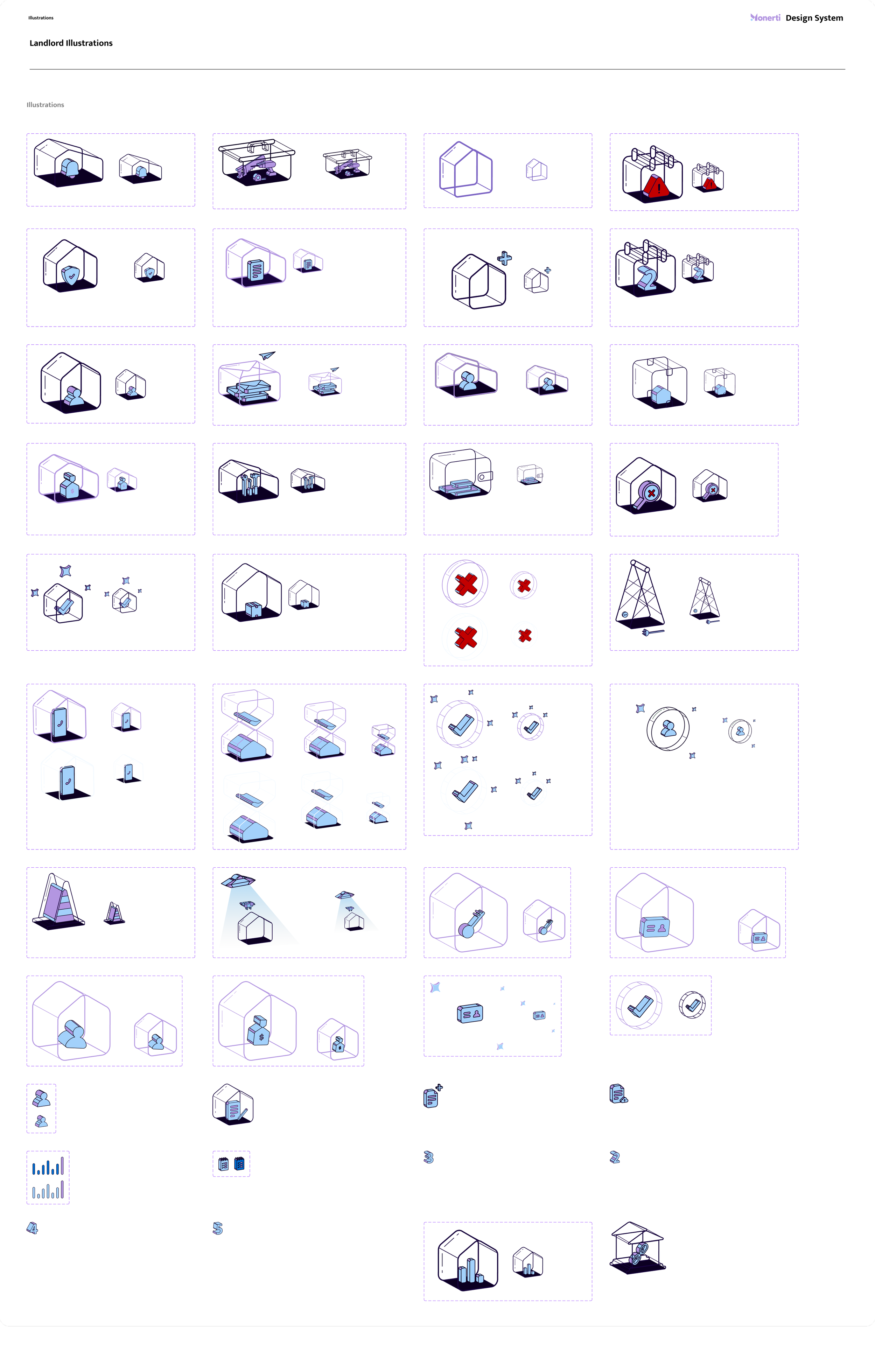
Comprehensive design system that brought consistency, clarity, and a more engaging experience